Judging A Book by Its Cover
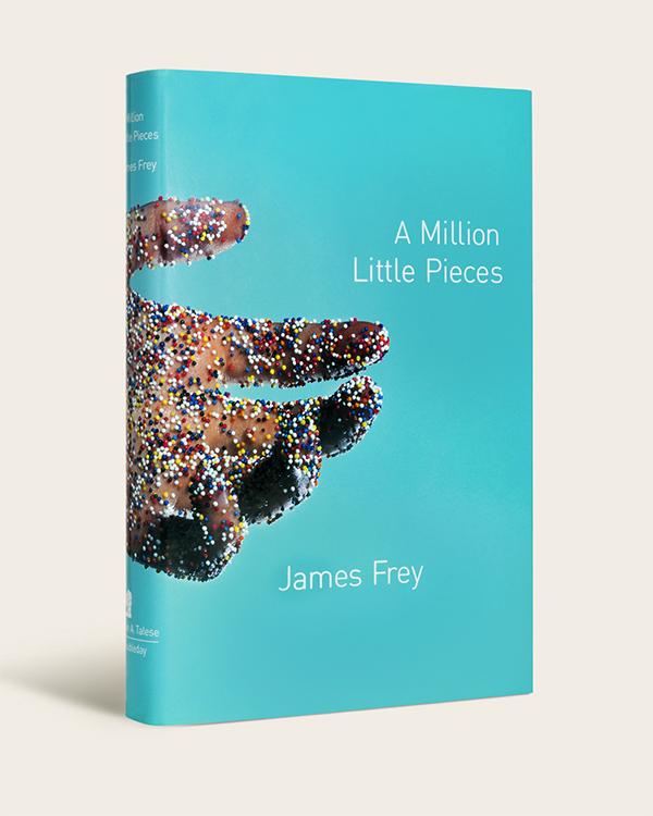
Book designer and graphic artist Rodrigo Corral was strolling through New York when he passed by the baking supply store N.Y. Cake. Immediately, a display of colorful nonpareils sprinkles caught his eye. The tiny rainbow beads of sugar became “one of those things that I instinctively love and feel like there’s a home for as an idea,” said Corral, who runs the design firm Rodrigo Corral Studio in New York.
Not long after, he began designing the cover for A Million Little Pieces by James Frey, the 2003 bestseller about a recovering addict. Images of these colorful candy sprinkles coalesced with memories of old pharmaceutical commercials, which frequently showed how medicine coursed through a human body. “I couldn’t shake what drug addiction would look like through the body,” said Corral, who is also creative director at Farrar, Straus & Giroux (FSG) and creative director-at-large for New Directions. He hired a photographer and sent him a packet of sprinkles. Together, they came up with what has become one of the best-known covers of the last two decades: a hand, open and extended, covered in candy dots. It was, in the world of cover design, a direct hit.
|
Rodrigo Corral. Photo by Anna Kassoway |
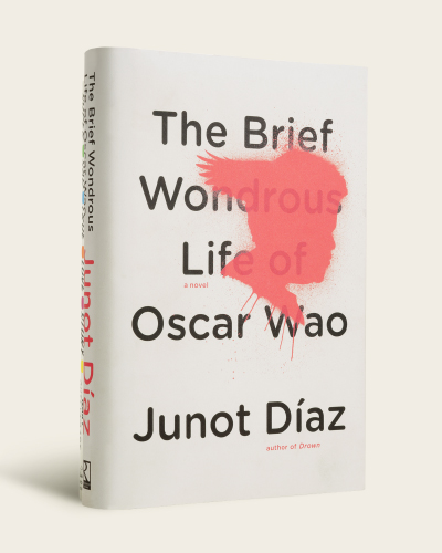
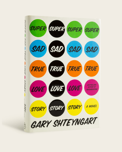
This is the sort of success that has defined Corral’s career. He has designed covers for Junot Díaz, Lauren Groff, Chuck Palahniuk, Gary Shteyngart, and NEA Fellows Jeffrey Eugenides and Jonathan Franzen. His covers are both instantly recognizable and difficult to forget. There is the swooping script and simple wedding band of Eugenides’s The Marriage Plot; the mod, neon polka dots of Shteyngart’s Super Sad True Love Story; and the unsettling, spray-painted silhouette of Díaz’s The Brief Wondrous Life of Oscar Wao.
His philosophy is relatively simple. “Make art, while balancing marketing concerns,” said Corral. Corral might be guided by marketing or sales departments to use a specific color that research has found effective for a particular readership. Other times, he might be given specifications for the point size of an author’s name depending on their renown.
|
But his portfolio is bold enough that if contacted by a publisher, “there’s probably room to make it a little unconventional or not necessarily fitting a specific mold of the marketplace.” Corral strives to “bring an unexpected perspective, an unexpected translation that communicates the idea [behind the story],” he said, while simultaneously “leaving room for readers to make a discovery on their own.”
Timelessness is also a critical piece of Corral’s creative approach. “My desire to make timeless art for authors is a priority,” he said. One of his biggest fears is that a cover might feel dated, or evince a specific period, five or ten years down the line. It’s a real fear: covers are frequently redesigned to renew interest in a book, promote new editions, or reach a different readership. Corral himself has led many redesigns, including Nausea by Jean-Paul Sartre and Siddhartha by Herman Hesse, a cover that was notable for its lack of title or author name.
But whether he is designing a classic text or a new manuscript, the process begins the same way: by reading. The things that excite Corral most about a manuscript are those that would excite any reader: a fresh direction or unexpected twist, strong character development, powerful arc, or social relevance. “From a design perspective, our radar’s pretty high for authenticity,” he said. “What we look for in a good read is getting lost in a story, being moved, and having our reality suspended momentarily. If those things are working, then I’m excited to go in and start trying to find a good solution for that book.”
To find a book’s “solution,” Corral draws on a vast library of inspiration, which includes artists such as Robert Gober, Francis Bacon, and Felix Gonzales-Torres, as well as a healthy archive of newspaper and magazine clippings he has collected through the years. “Whether it be composition or an expression on someone’s face, I’m always collecting images, color swatches, and taking notes—even on a simple word combination that I think holds potential ideas,” he said.
|
As was the case with A Million Little Pieces, his surroundings are also an endlessly rich source of stimulation. “I break the golden rule in New York, which is don’t make eye contact,” he laughed. “I’m the total opposite. I’m on the subway and I’m staring at people and mesmerized by their body language or gestures or what they’re carrying or what they’re wearing. The inspiration comes from anywhere, so I try to be as open as I possibly can.”
For any given project, he and his team generate two to three cover ideas. “We generally send two incredibly distinct approaches that have nothing to do with the other, and then maybe a third option that is a combination of the two,” he said. Often times, he will collaborate with other painters, illustrators, photographers, and stylists in order to achieve a certain effect, as he did with A Million Little Pieces. “That was an example of needing to have a great photographer who understands composition and lighting,” he said. “I couldn’t have composed that myself. That’s not something I could sketch with a pencil, or I could have even shot today with an iPhone.”
These artistic collaborations, however, do not usually extend to the authors themselves. Authors, he said, are so close to the story that cover design can ultimately prove stressful and complicated for all parties. He has never met Chuck Palahniuk for example, for whom he has designed a dozen covers; the two have only ever exchanged cursory notes of “here’s the manuscript” and “good luck.” One notable exception was Jay-Z, who walked Corral through his apartment and shared personal stories and inspirations. The experience, which Corral described as “surreal,” informed the cover of Jay-Z’s memoir Decoded, which prominently displays a gold foil rendition of Andy Warhol’s Rorschach print.
It is only after weeks of research, collaborating, designing, and tweaking that Corral’s proposals are reviewed by a publisher. Although approval is obviously the end goal, he noted how this can occasionally be at odds with creativity itself. “As book jacket designers, we’re doing so many projects simultaneously that it could be easy to give a solution that we think could get approved,” he said. “Instead, what we try to do is push. It’s something I suggest for all creative designers: push yourself even further and give something you feel strongly about. Taking those chances as a creative and then putting it in front of a client, publisher, editor is the only way you’ll find out whether it will work or not.”
|
Creative risk can pay off in unexpected ways as well. Many book cover designers feature rejected proposals as part of their online portfolios and Instagram feeds, giving potential clients a broader look at their abilities. Just a few weeks ago, Corral said, his studio posted a rejected cover from a few years back on Instagram. Within hours, Corral’s studio was contacted by a creative director who was interested in using the design for a forthcoming title.
Although a project technically ends with approval, it is also the start of something arguably more satisfying: seeing your work in the public sphere. Corral has designed so many revered and bestselling titles that his work has become fairly ubiquitous. He recently passed by a Warby Parker eyewear store, where a display of books included Oscar Wao, which was published in 2007. “The fact that they haven’t changed the cover is reassuring that my approach to design and making art is pretty solid,” he said. “I can be on the subway and see someone reading a book that I designed ten years ago. It reaffirms why I love being in this industry and making art for books.”


